Style Notes
7 Clothing Colors That Photograph Well — And When to Use Them
A color can look good in person but photograph differently depending on lighting, background, exposure and surrounding colors. The goal is not to find one universal color, but to choose a color that works with the scene.
Quick answer
Choose color in relation to the scene.
The easiest colors to photograph are usually ones that create clear separation from the background, avoid extreme brightness or deep shadow loss, and fit the lighting in the scene.
Color comparison
How do these clothing colors behave in photos?
| Color | Works well with | Best situation | Watch for |
|---|---|---|---|
| White / soft ivory | Darker or colorful backgrounds | Daylight, clean indoor settings | Blown highlights |
| Black | Bright or textured backgrounds | City, evening, simple portraits | Shadow detail disappearing |
| Navy | Warm neutrals, cream, stone | Indoor and outdoor portraits | Looking almost black in low light |
| Cream / beige | Warm interiors, greenery, brown tones | Soft daylight, lifestyle photos | Blending into pale backgrounds |
| Red / burgundy | Neutral backgrounds | Strong focal-point portraits | Oversaturation |
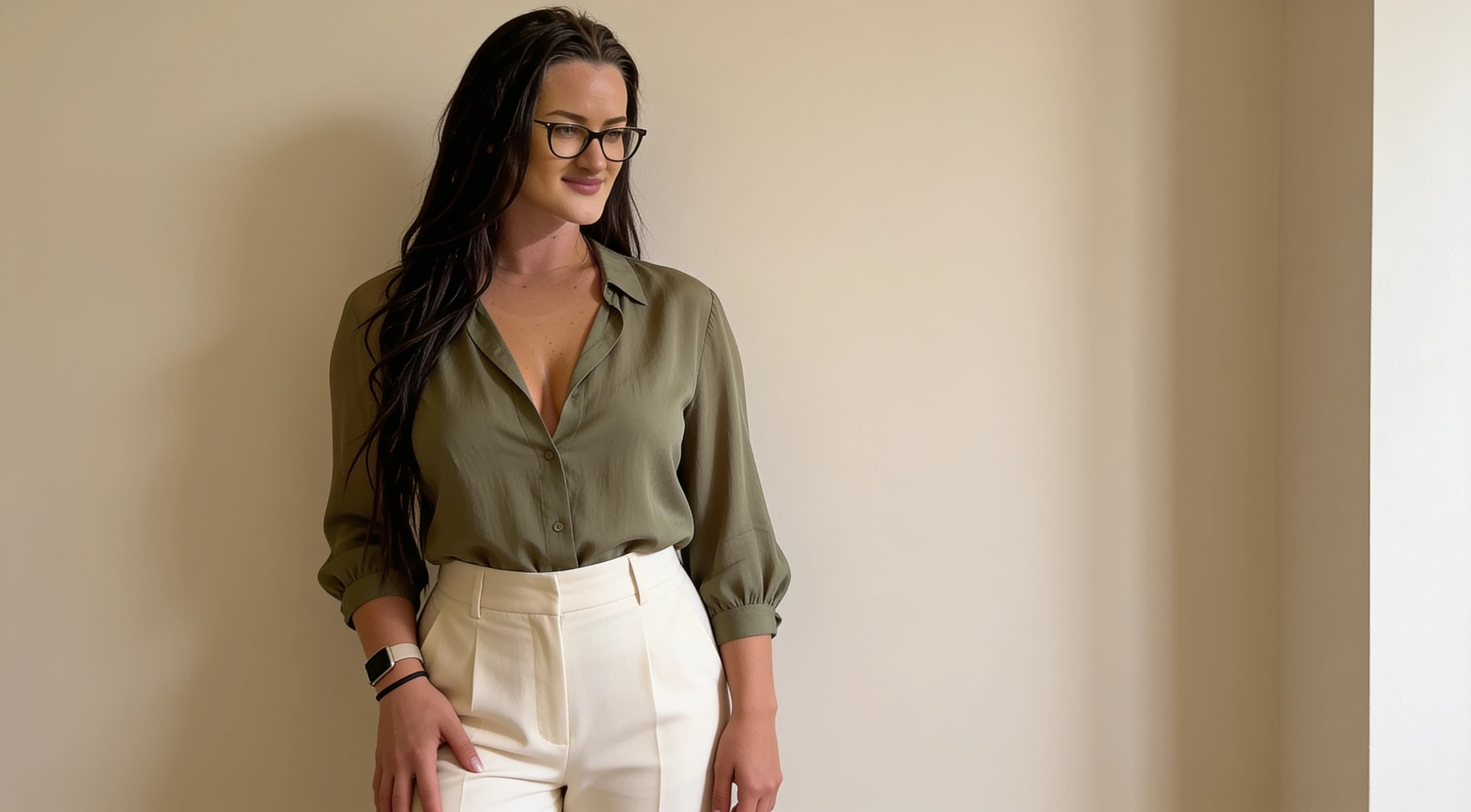
| Olive / muted green | Cream, stone, wood, urban neutrals | Outdoor and earthy settings | Blending into foliage |
| Soft blue | Warm interiors, neutral walls, denim | Daylight and casual portraits | Cool lighting making skin and background feel flat |
Seven colors
7 clothing colors that photograph well
These are practical clothing colors for photos, not rules about what flatters every person. Use them by checking background separation, exposure, surrounding colors and the light in the location.
COLOR 01
White / soft ivory
What it looks like in photos
White and soft ivory can look clean, bright and crisp in photos, especially when the background is darker, colorful or textured.
Best background pairings
Darker walls, greenery, city backgrounds, wood, denim and colorful interiors can give white clothing clear separation.
Best lighting situations
Soft daylight and clean indoor light are usually easier than harsh direct sun or bright window backlight.
Why it can work
Light fabric naturally draws attention and can make a simple outfit feel fresh. Soft ivory often keeps a similar effect while being less harsh than bright white.
Watch for
Bright white can lose fabric texture if the exposure is too high. Reflective satin, silk or shiny white fabric can lose highlight detail quickly.
One easy outfit example
Soft ivory shirt + dark denim + a warm wood or greenery background.
COLOR 02
Black
What it looks like in photos
Black can look clean, graphic and polished when the background has enough brightness or texture to keep the outfit visible.
Best background pairings
Bright walls, stone, city lights, pale interiors, reflective surfaces and textured locations can help black clothing keep its shape.
Best lighting situations
Evening city light, window light and simple portrait light can work well when there is some separation behind the outfit.
Why it can work
Black simplifies the outfit and can make the face, silhouette or surrounding light more noticeable.
Watch for
In very dark scenes, black fabric can merge with shadows. If exposure is too low, texture and edges disappear.
One easy outfit example
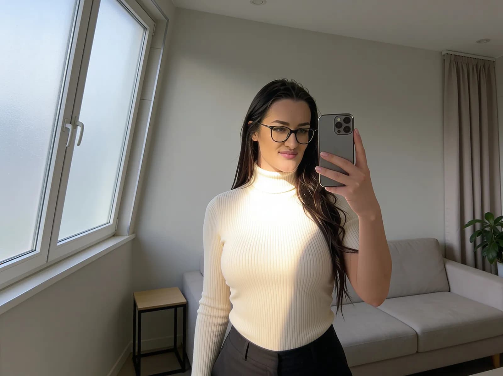
Black knit top + light stone wall + simple gold or tan accessory.
COLOR 03
Navy
What it looks like in photos
Navy often photographs as softer than black while still giving structure and depth.
Best background pairings
Cream, stone, warm neutrals, pale walls, tan, camel and soft wood tones pair naturally with navy.
Best lighting situations
Daylight, open shade and balanced indoor light usually show navy more clearly than very dim evening light.
Why it can work
Navy gives contrast without the starkness of black, which can make it useful for both indoor and outdoor portraits.
Watch for
In low light, navy can look almost black. If the background is also dark, the outfit may lose separation.
One easy outfit example
Navy blazer + cream top + stone or warm neutral background.
COLOR 04
Cream / beige
What it looks like in photos
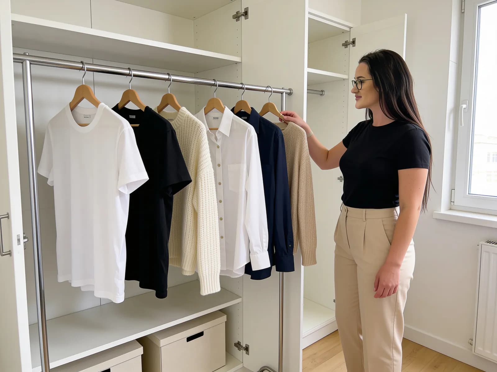
Cream and beige can create a soft lifestyle look, especially when the scene has warm interiors, wood, greenery or brown tones.
Best background pairings
Greenery, wood, camel, dark denim, warm café interiors and natural textures can keep beige from looking flat.
Best lighting situations
Soft daylight is usually the easiest. Warm indoor light can also work if the whole image does not become too yellow.
Why it can work
These colors feel calm and are easy to combine with other muted tones, which makes the photo look less visually noisy.
Watch for
Cream or beige can blend into pale walls, sand, light bedding or similar backgrounds. Small texture differences may not be enough.
One easy outfit example
Cream knit + dark denim + greenery or a warm café background.
COLOR 05
Red / burgundy
What it looks like in photos
Red and burgundy create a strong focal point and can make a simple portrait feel intentional.
Best background pairings
Neutral backgrounds such as black, cream, grey, stone, denim and plain interiors usually let the color stand out cleanly.
Best lighting situations
Soft daylight and controlled indoor light are easier than mixed lighting that pushes reds too warm or too saturated.
Why it can work
A strong color can guide the viewer's eye quickly, which is useful when the background is simple.
Watch for
Red can become oversaturated, especially after phone processing or heavy editing. Burgundy is often easier to control than bright red.
One easy outfit example
Burgundy cardigan + black trousers + simple cream wall.
COLOR 06
Olive / muted green
What it looks like in photos
Olive and muted green can feel earthy and relaxed without becoming as bright as stronger greens.
Best background pairings
Cream, stone, concrete, wood, denim, brown leather and urban neutrals usually give olive enough support.
Best lighting situations
Outdoor shade, soft daylight and warm interiors can work well, especially when the background is not the exact same green.
Why it can work
Muted green adds color while staying calm, which makes it useful in everyday outfit photos and outdoor locations.
Watch for
Olive can blend into foliage. If the background is a park or garden, choose a different shade or add contrast through denim, cream or black.
One easy outfit example
Olive jacket + cream tee + dark jeans against stone or concrete.
COLOR 07
Soft blue
What it looks like in photos
Soft blue can look fresh, casual and easy in daylight, especially when paired with denim, beige or neutral walls.
Best background pairings
Warm interiors, cream walls, beige, tan, denim, wood and simple city backgrounds usually pair well with soft blue.
Best lighting situations
Daylight and bright indoor settings tend to show soft blue clearly. Very cool artificial light can make the whole scene feel flat.
Why it can work
Soft blue gives visible color without the intensity of saturated brights, so it can be easier to use in casual portraits.
Watch for
Cool lighting can push the image too blue. Check whether the background and skin tones still look believable.
One easy outfit example
Soft blue button-up + beige trousers + neutral wall or warm window light.
Visual examples to compare
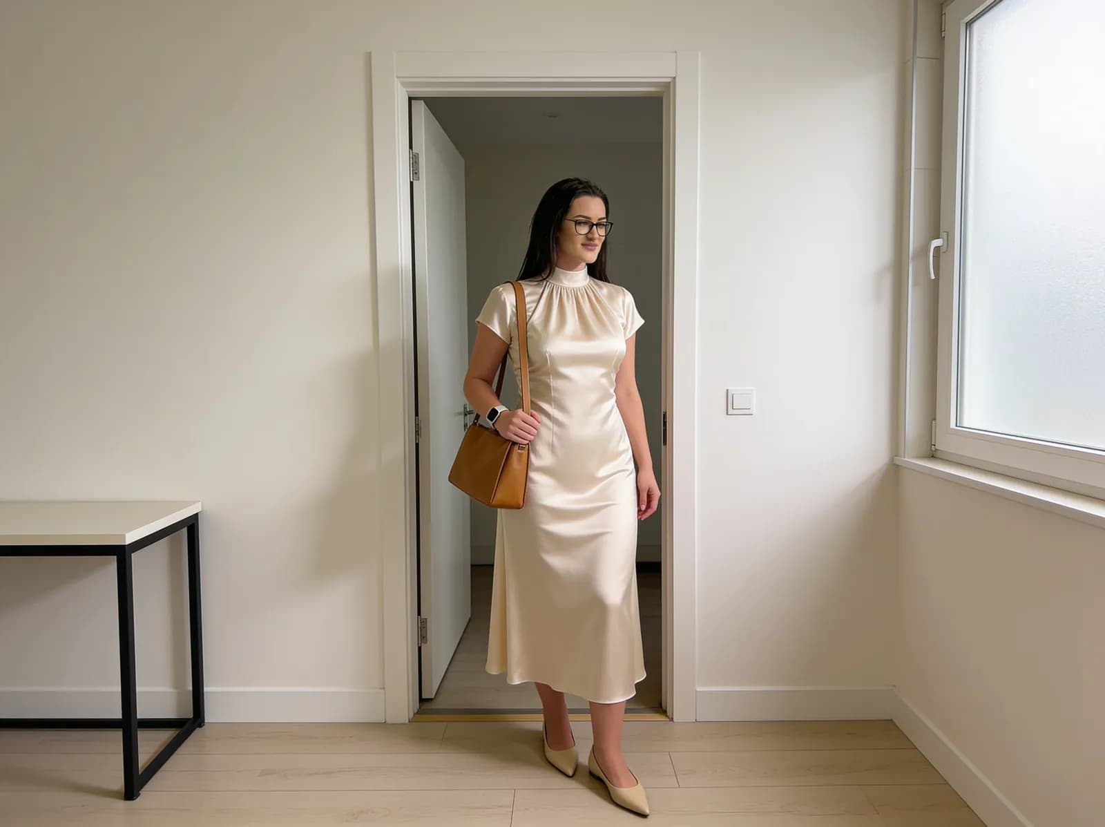
These existing examples are included to show lighting, background separation and color mood, not as scientific comparisons.
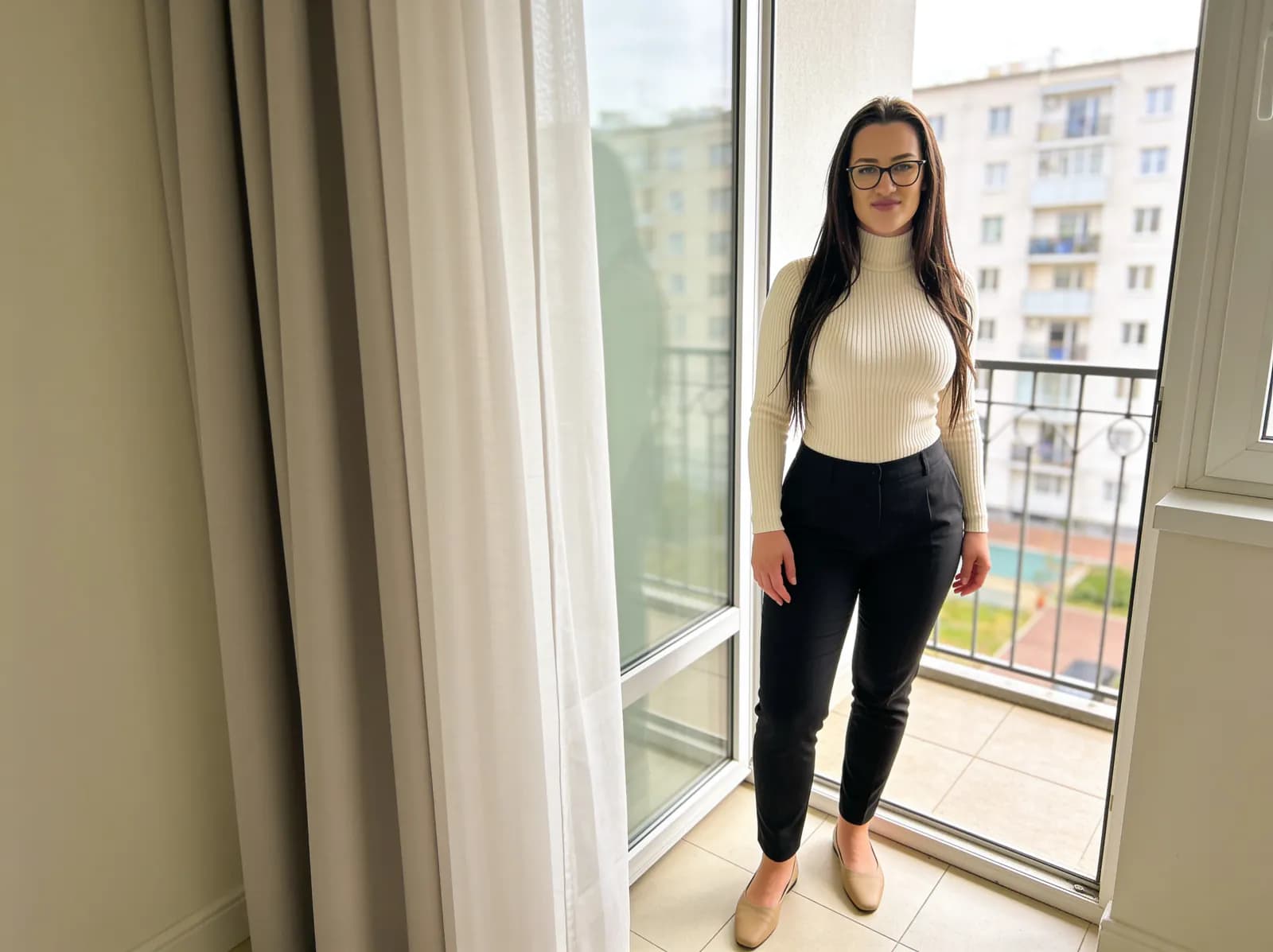
Background matters as much as clothing color
A dark outfit against a dark wall can lose separation. A pale outfit against a pale wall can blend into the background. Contrast does not have to mean black against white; texture, brightness and distance from the background also affect whether the outfit reads clearly.
A cream sweater can stand out against greenery or dark denim but disappear against a cream wall. A black dress can look sharp against stone or city lights but flatten against a dark doorway. Sometimes moving two steps to a different background solves the color problem faster than changing clothes.
Lighting changes how colors appear
Daylight, warm indoor light, cool artificial light and mixed light can all shift how clothing color appears in a photo. Warm indoor light can make cream and beige look more yellow. Cool artificial light can make blues and whites feel flatter.
Phone white balance and processing also affect color. The same navy shirt can look rich in daylight and nearly black in low light. The same white top can look clean in shade and too bright beside a sunny window.
Why white can be difficult
Bright white can lose texture when the exposure is too high. Reflective satin or smooth white fabric can clip highlights quickly, especially in direct sun or near a bright window.
Soft ivory or cream may be easier in some scenes because it keeps a light, clean feeling without pushing highlights as hard. When photographing white clothing, expose carefully enough to protect fabric detail.
Why black can be difficult
Black clothing can merge with shadows when the background is also dark. If exposure is too low, texture, seams, folds and the outline of the outfit may disappear.
Background separation matters more with black than many people expect. A brighter wall, window, streetlight, pale sofa or textured surface behind the outfit can make the shape visible again.
Strong colors vs muted colors
Strong colors
Strong colors create more visual impact and can work well as the focal point of the image. They can also become oversaturated, especially with heavy editing or intense phone processing.
Muted colors
Muted colors are often easier to combine with the environment and can create a calmer look. They may blend too much if the background is very similar.
Neither option is universally better. The stronger choice depends on the background, light and how much attention the clothing should receive in the frame.
How to choose color for the location
Green park
Avoid matching the foliage exactly if you want separation. Cream, navy and burgundy can stand apart from green without making the scene feel overly busy.
Warm café
Cream, navy, olive and soft blue can work well. Very similar brown or beige tones may blend into wood, tan seating or warm walls.
Dark city street
Lighter or saturated pieces can separate from the background. Black can work, but it needs controlled light or a brighter surface behind it.
Bright white interior
Darker or muted colors can create shape. White clothing may need careful exposure so fabric detail does not disappear.
Beach / bright outdoor scene
Avoid letting white fabric lose texture. Blues, muted green and warm neutrals can work when the exposure protects highlights.
Phone-camera color problems
Phone cameras often adjust white balance, exposure, saturation and HDR automatically. Artificial lighting can make a color look warmer or cooler than expected, and processing can make strong colors look more intense.
Exact behavior varies by device, camera app and lighting. A quick test photo is more reliable than guessing from the mirror. For indoor light decisions, see natural indoor phone photography.
How to test an outfit before taking photos
1. Stand in the actual location.
2. Take one test photo.
3. Check clothing/background separation.
4. Check highlights.
5. Check skin and clothing color cast.
6. Move slightly or change angle if necessary.
7. Compare one alternative color if available.
If the background is the problem, changing location may be easier than changing the outfit. The home photo background guide has practical examples for finding cleaner settings.
Common color mistakes in photos
Matching the background too closely
A beige outfit against a beige wall or olive clothing in dense greenery can make the person blend into the scene.
Bright white under harsh light
Strong light can remove texture from white fabric. Soft ivory or a slightly darker background may be easier.
Black in very dark scenes
Black clothing can disappear into shadows unless the background or lighting creates separation.
Oversaturated reds
Red and burgundy can be useful focal points, but phone processing or heavy editing can make them look too intense.
Too many strong colors competing
Several saturated colors in the outfit and background can make the photo harder to read.
Ignoring mixed lighting
Warm indoor light, cool signs and daylight can all affect the same outfit differently in one frame.
Editing color until clothing no longer looks believable
A clean edit should improve the photo without making fabric color look unrelated to the real scene.
Quick color checklist
✓ Does the outfit separate from the background?
✓ Is fabric detail still visible?
✓ Are highlights clipping?
✓ Are shadows hiding the outfit?
✓ Is one color dominating too much?
✓ Does the color still look believable after phone processing?
✓ Would a different background solve the problem faster than changing clothes?
Color combinations that are easy to repeat
These combinations are useful because they create simple contrast or a controlled palette. They are starting points, not universal rules.
White + denim
Simple contrast, familiar texture and easy separation from many indoor or outdoor backgrounds.
Navy + cream
Clear contrast without feeling as stark as black and white.
Black + camel
Dark structure with warmth, especially useful against pale or city backgrounds.
Burgundy + black
A controlled focal color with a simple base that does not compete.
Olive + cream
Muted color with enough lightness to keep the outfit visible.
Soft blue + beige
A calm daylight pairing that works well with neutral walls and denim.
Cream + dark denim
Soft top contrast with a grounded bottom, useful for casual portraits.
Build the full outfit around the color
Once the color works with the background, make sure the outfit itself still feels balanced. For practical outfit structures, read simple everyday outfit formulas.
For night scenes, color behaves differently because bright signs, headlights and dark backgrounds can dominate the frame. The city night photography guide explains how to protect bright highlights and keep color believable after dark.
About the visual examples
Sofia is a fictional virtual creator. Any visual examples on this page are digitally created and used to illustrate clothing color, lighting, background separation and composition concepts.
About this guide
Sofia is a fictional virtual creator. This guide is published by SofiaRusso.vip and maintained by the site owner. AI tools may assist with drafting or illustrative imagery, while the final published material is reviewed before publication.